About font
Font format
To display characters on the screen, font data is required.
Fonts can be classified into bitmap fonts made of a set of pixels and outline fonts made of outlines.
Among these, the outline fonts are free to scale.
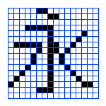 |
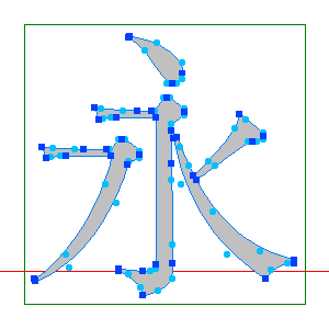 |
| Bitmap font |
Outline font |
Outline fonts come in several forms, but the followings are common on Macintosh and Windows:
- TrueType Font
- A format developed by Apple and Microsoft.
The font design uses B-spline curve.
- Type 1 font (PostScript font)
-
A font developed by Adobe.
Bézier curve (the curve for Illustrator) is used to represent outlines.
Windows XP or later and Mac OS X support PostScript fonts as default.
Now most PS fonts have been converted to OpenType format below.
- OpenType Font
- A new type of font format that integrates TrueType and Type 1 fonts.
Windows XP and Mac OS X use OTF as the standard font format.
This is convenient because the same font file (extension .otf ) can be used in both Windows and OS X.
The character code has also become common between Windows and Mac OS X.
For Japanese OTF fonts, Moriwasa typefaces (Ryumin, ChuGothic, ShinGo, etc.) are widely used in the printing industry.
Hiragino series (Dainippon Screen) which comes standard with Mac OS X, and Kozuka series which comes with Adobe products, are also becoming popular in Japan.
Font size
Font size is usually expressed in units of points (Pt).
Originally, 1 point = (1/72.27) inch = about 0.35 mm, but 1 Adobe point = (1/72) inch is usually used instead.
The font size often used for printing books is around 10 points.
The font size is the height which the font fit in.
In Western fonts, the font width is usually smaller than the font height.
There are two types of widths for Western fonts: fixed (monospaced) fonts and proportional (variable width) fonts.
Japanese fonts are usually designed to fit in a square, but some fonts have variable width for Kana characters.
In Japanese fonts, alphanumeric characters are fixed or proportional depending on fonts, as in Western fonts.
Baseline is defined for every font.
When multiple fonts are mixed, the baselines are usually aligned.


Kerning and tracking
For Western fonts, it may be natural to place characters closer depending on the combination of characters.
Such shortening of the space between characters according to the combination of characters is called "kerning".
For Adobe products, kerning is enabled by selecting "Metrics" (based on the kerning information) or "Auto" in the kerning settings of the character palette, and disabled by selecting "0" (see below).
* In the recent versions of the Adobe product, in addition to "Metrics" and "Automatic", "Optical" (based on the area between characters) is available.
 ← kerning option

There is a case where it is necessary to adjust a space between characters in order to align the right end of lines for layout.
This is called "tracking", and the space between characters is evenly adjusted usually.
Prohibited characters and hyphenation
In a Japanese layout, some characters must not appear at the end of a line, and some must not be at the beginning of a line.
When these prohibited characters come near line breaks, it is necessary to adjust the letter space.
In many word processors, if you specify the prohibited characters, prohibition processing will be performed automatically.
In European languages, line justification is performed by adjusting the space between words. If that doesn't work, break the word with a hyphen and continue on the next line. There is a fixed place in a word where you can put a hyphen (roughly a syllable break). There is no guarantee that you can put a hyphen anywhere, so you must look it up in a dictionary and be careful. Most word processing software has hyphenation rule data and automatically inserts hyphens.
Examples of forbidden characters
・Forbidden at the beginning ... !% ),.:;?]}° ’ ” ‰ ′ ″ ℃ 、。〉》」』】〕々ゝゞヽヾ ・ ー っゃゅょァィゥェォッャュョヮヵヶ
・Forbidden at the end ... $£¥([{ ‘ “〈《「『【〔
In European languages, line justification is performed by adjusting the space between words.
If that doesn't work well, break the word with a hyphen and continue on the next line.
There are such places in a word where you can put a hyphen (roughly a syllable break), so you must look up a dictionary.
Fortunately, most word processors have hyphenation data and will automatically insert hyphens.
Font samples
Samples of major Japanese fonts and Western fonts are shown below.
There are Serif fonts (with decorative strokes), Sans Serif fonts (without decorative strokes), and Script fonts (handwritten characters).
Most typefaces have italics (or obliques).
In addition, each font family usually has a different font weight (e.g., Light, Regular, Medium, Bold, Heavy, Ultra, etc.).
Windows ... fonts included with Windows and Microsoft products
Macintosh ... fonts included with Mac OS 9 and Mac OS X
Adobe Part 1,
Part 2,
Part 3,
Part 4,
Part 5,
Part 6 ... fonts and optional fonts included with Adobe applications.
Basic Western fonts (Times, Helvetica, Courier, Symbol) are the same as those mounted on PS printers.
Morisawa ... Morisawa's Japanese fonts.
Some fonts are mounted on PS printers.
Other fonts ... Others 1, Others 2
Back


 ← kerning option